Written by Erin Gamble, this article originally appeared on nten.org on July 21, 2015.
Why would mapping communities be important for communications efforts?
Mapping is important because it can help us see where we are (current boundaries), where we’ve been (past reach), and where we’re going to go (gaps and opportunities).
It can share insights that might be buried in a narrative write-up that’s too dense or a data set that’s complex and hard to decipher.
Figure 1: Example of a relationship matrix
Mapping can help us explore new ways of approaching our work by showing where boundaries lie or patterns exist.

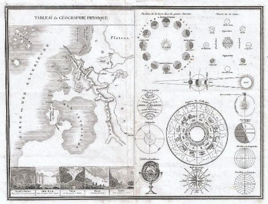
Figure 2 Image Source: Wikimedia Commons
You can map anything that involves two or more actors—organizations, donors, employees, machines, etc.—that have (or lack) relationships.
It can be done by hand, using desktop software, or more robust tools.
At the Leading Change Summit (LCS) in September, we will be exploring several different tool options and frameworks. The connection among these different approaches is creating a visual representation to look at data in a new way.
One very powerful framework to do that is using a framework called Social Network Analysis, also called Network Analysis.
Math and Maps
Social Network Analysis (SNA) is a methodological approach that measures and maps network relationships. It is a conceptual framework that applies graph theory to sociological studies.
For organizations, individuals, groups, and so much more, SNA can be a powerful approach to understanding your various relationships. Possibilities of network analysis application are almost endless—network analysis can examine audience connections, innovation diffusion, disease outbreaks, sales—anything where there is an interaction between two or more network players.
You can create maps to see:
- information flows (where does information get collected or pass through)
- learning or knowledge-sharing (who do people seek out to ask questions? where are cross-discipline connections sharing within an organization?)
- attendees of events (who's been to multiple events?)
- donations to fundraising campaigns (which donor has contributed to several campaigns and by how much?)
- key nodes within a network (what's an actor's Kevin Bacon number?)
There are many ways to you can get data to explore social networks. Digital channels like Facebook and Twitter can be especially reach sources of information.
Curious about which individuals and organizations are using your hashtag?
Map it!

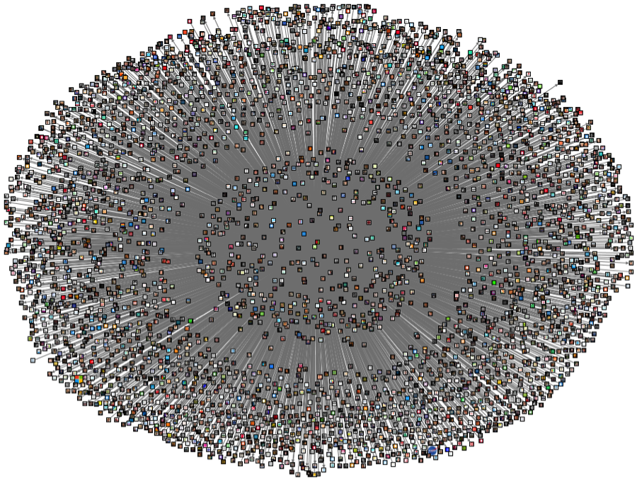
Figure 3: Snapshot-in-time map of 100 tweets on July 17, 2015, of Twitter accounts using the hashtage #endpoverty. Nodes labeled by Twitter image and sized based on number of followers. Tweets limited to 100. Map created with NodeXL.
Want to see who is connected to you on Twitter?
Map it!
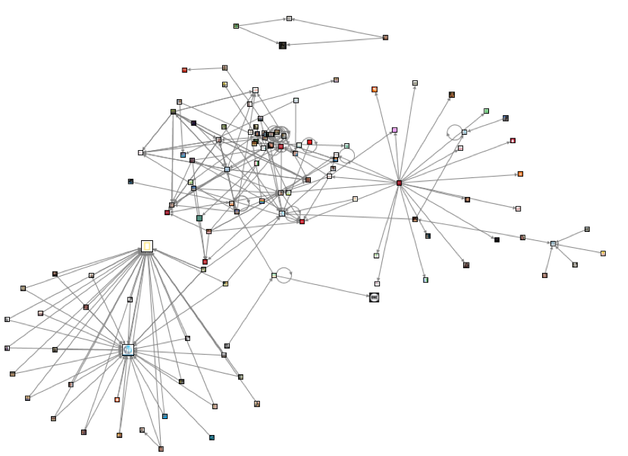
Figure 4: Snapshot-in-time map of NTENorg Twitter account on July 17, 2015. Limited to follows, mentions, an replies on that date. Boundary of 200 recent tweets per user. Map created with NodeXL.
Looking to see who donated to your various campaigns and the size of their donations?
Map it!
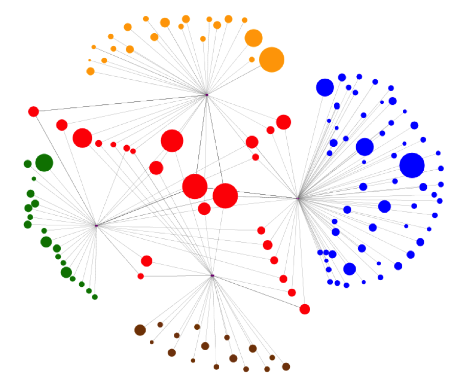
Figure 5: Map of donation network comprising of four campaigns. Each node represents a donor and is scaled by aggregated size of donation. Red indicates donors who donated to multiple campaigns; other colors indicate different campaigns. Map created with NodeXL.
Note: these visualizations build off of data sets built in NodeXL (a free, open-source tool) that contain even more robust information on these individual actors’ attributes and relationships. These images serve just as a “tip of the iceberg” to the relationship data.
Is Mapping Everything?
Maps are visualizations of data to help see patterns and explore new ways of understanding information.
Connections are key to communities for social capital, identity construction, and information flows. SNA visualizes these network flows through nodes (individuals, organizations, events, etc.) and links (connections/interactions). These links can vary depending on context, even with the same actors.
It is important to note that network actors are complex. For instance, people can have a multiplicity of expressions—dynamic, evolving roles that change overtime—within the same network.
Think of your family network. Sometimes you may be the “leader” of your family network, say, if you are organizing a family reunion; but other times, you may be the invitee when someone else takes on that organizer role for a birthday party or a hike.
Also, networks are not based on one actor of course; they may well have multiple leaders as other roles. People are complex. Organizations as well. Naturally, networks ought to reflect this complexity.
This network richness is an important element for organizations and individuals alike to grasp as they examine networks and relationship structures.
Limitations to Mapping
Just as mapping an unknown terrain, maps are only as good as the data that are imputed into them. Limitations of mapping can include a small sample size, respondents may not be representative of entire audience, questionnaires may have been confusing yielding inaccurate results, and so on.
Also, mapping is not a strategy unto itself—it is a tool to better see patterns, boundaries, and gaps in relationships. It allows us to help inform our strategies, not create them.
Mapping allows us to see the landscape of relationships over time. As an NGO’s online community grows, it reaches new audiences by tapping into its members’ networks and leveraging them to in turn tap into further new networks.
Relationships, of course, are dynamic and can be actively shaped. This gives us much power and also necessitates us to repeat the mapping cycle by issuing a new survey, collecting new data, and analyzing the findings.
What have you mapped? What would you like to map? What tools and techniques have you found useful? Would love to hear your thoughts in the comments below.
Erin Gamble is Online Communications Officer at the World Bank Group. She is passionate about social network analysis, social good, and digital strategy. Views expressed here are hers. You can find her on Twitter @eringam. 