The Zine: How to Use Your Visual Brain to Improve Reporting & Intentional Learning

Kat Haugh is a Monitoring, Evaluation, Research, and Learning Specialist on the USAID LEARN contract.
We all have them: that 50-page report sitting on your desk that you’ve never read. And when you think about reading it, you cringe. You just can’t do it. And there’s a good reason for that, research and experience show that in order for information to be used for learning and adapting, the information itself needs to be easily accessible.
How do we present information in a way that capitalizes on opportunities for information to actually be digested and used (and avoid the dreaded 50-page report)?
One way the USAID LEARN contract makes data more accessible and actionable is through visual storytelling. We use metaphors, doodles, storylines, and designs to communicate about our work and better understand what our data is telling us about our progress and impact.
We’ve recently piloted a new visual storytelling technique called a zine. The term zine is short for magazine and is a self-published visual story with a combination of text and images. Zines are a visual reporting tool used to distill complex information (like information about financial investment or climate change) into short, easy-to-read, creative stories. Everyone can be an author (and also an editor, designer, and publisher) of a zine, and that is part of what makes them so powerful.
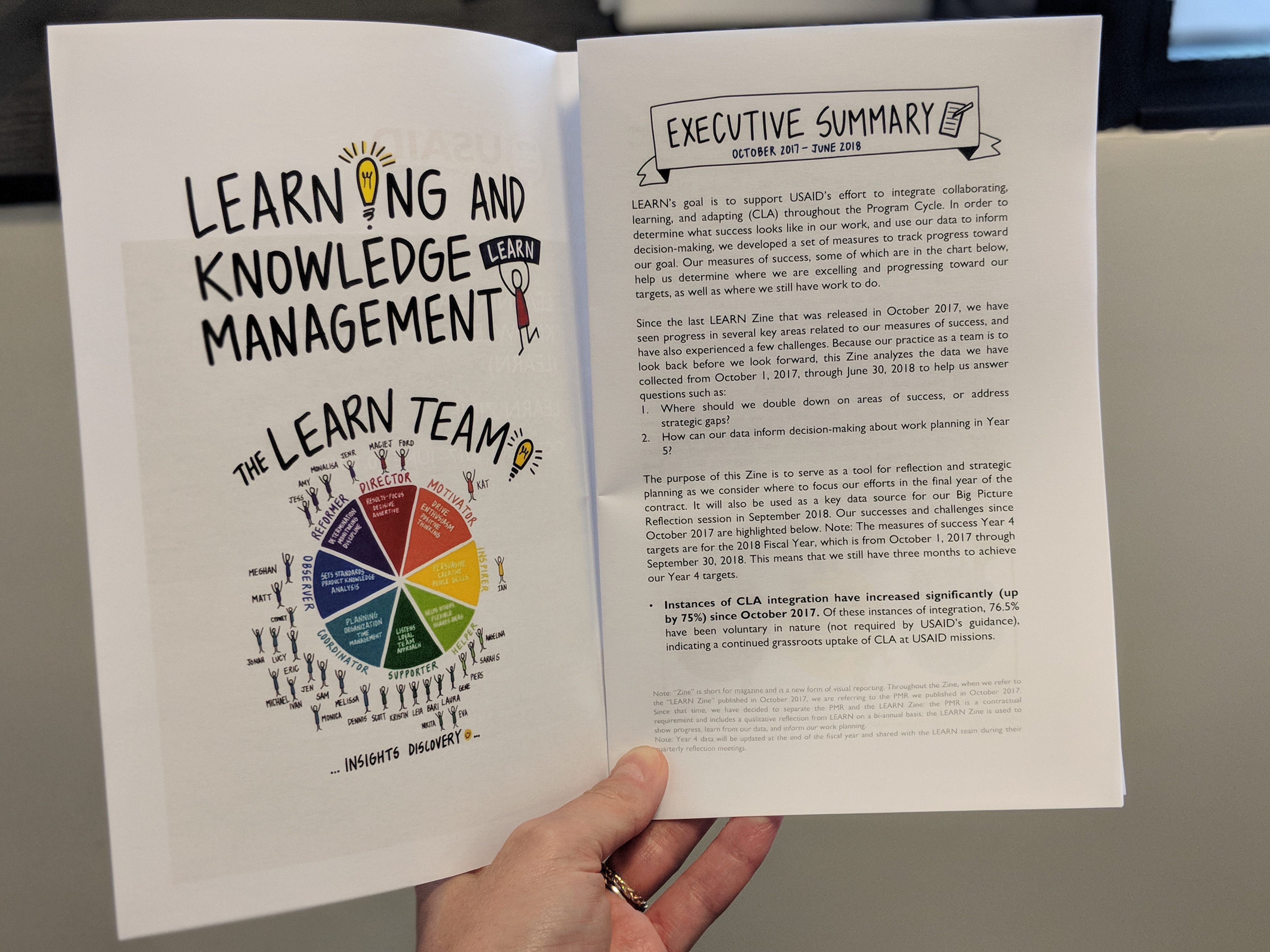
We got inspired by zines and so we created one about our work on LEARN. The finished product looks like this:

If you can’t tell from the picture, the Zine is a small (8.5 x 11 inches) booklet that includes minimal text and lots of visuals. It’s written in story-form, with no jargon or flowery words. That’s because the focus is on communicating the information as succinctly and efficiently as possible and presenting it as a story. We do that because our brains not only make sense of visual information more quickly, but we are also far more likely to remember stories.
On our journey to creating a zine about our work, we learned a few key lessons:
- Need to know > nice to know. Given the limited space in the zine, we had to be really strict about what was absolutely necessary to communicate and what was not.
- Ideal visual to text ratio. To avoid overdoing it with the amount of visuals in the zine and overwhelming our audience, we followed guidance from data visualization experts like Stephanie Evergreen and others about the appropriate visual to text ratio.
- Co-creation of recommendations is helpful. In order to make the content of the zine as useful as possible, we worked within our team to co-create the recommendations about changes we’d make in our work in response to the data that was reported in the zine.
- Facilitation is needed for internalization. Just sharing the zine is not enough for the information to be adequately digested and used for decision-making. Facilitating the internalization of the information through an exercise (like a madlibs game) is critical for the information to be downloaded by your team.
Like all types of reporting, the zine comes with its own pros and cons. The pros are that this type of reporting focuses on what is most important, is told in story-form, and is highly visual and engaging. The cons are that the zine cannot always capture the details and the visuals can feel overwhelming to some.
There is a lot of opportunity in our field to improve the way we are communicating about our work. We’d love to hear how you are using your visual brain to do it! Please share your stories with us. And, click here to see one of our zines.
Tip: To learn more, there’s an entire wikipedia page devoted to zines and if you type “zine making” into Amazon, you’ll get 10 pages of results. There may also be a zine-making community near you.


