Making Data Meaningful: Why Information Design is a Critical Skill for Global Health Professionals
This blog post originally appeared on JSI's blog, The Pump, on April 15th.

The global health community is data rich.
We can download data from the World Bank and Demographic and Health Surveys to cond
uct secondary data analyses with the click of a mouse. Local partners use community scorecards to assess quality and availability of services on a quarterly basis across dozens of sites. Introduction of electronic HIS platforms streamlines the collection and aggregation of routine health, logistics, and human resource data. mHealth applications generate massive datasets of usage data from app users that can provide insights on where users are finding value in within the app. PEPFAR reporting data drills down to the site level in order to identify hot spots for HIV within a country.
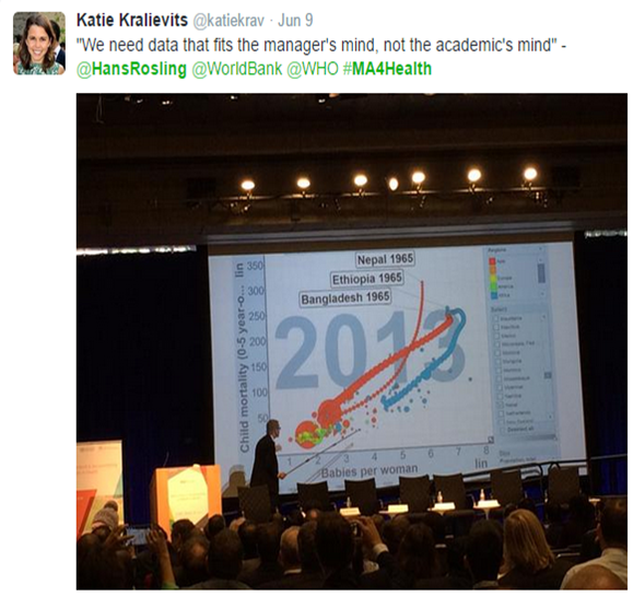
For all of that data to mean something to decisionmakers, global health professionals from all technical domains need to build our skills to make data visual, accessible, and meaningful. How we share and present our findings so they’re accessible to program managers and decisionmakers is the critical last step in making all of that data mean something.
While there have been incredible advances in the application and use of visualization in global health in the eight years since I started my MPH, it’s not enough to have one person on a team who skilled at packaging information into accessible formats.
Click here to read the rest of this post on The Pump.
Photo Credit: Katie Kravlievits


